
Food truck patrons need a reliable, efficient way to grab lunch during a busy workday.

The product: A food truck menu app for customers with limited time
Project duration: ~ 3 months

The problem
Users with busy or hectic schedules need to order and pickup food quickly, as they don’t have time to prepare meals before, during or after work.

The goal
Build a menu app for the Tapas Estrella food truck that helps users place orders; enabling customers to quickly and reliably order and eat while on the go.

My role
UX & Visual designer

Responsibilities
Sketching, user research, wireframing, prototyping, interaction, visual design, and illustration.

User research summary
I conducted a number of interviews with a variety of users to understand their wants, needs, and where their daily food experiences can be improved.
The users I interviewed confirmed issues that I had suspected would pop up in most cases, but also described multiple other aspects of the ordering process I hadn’t considered.
Other issues they included were communication, effective time management, nuanced issues like untenable wait times while in line, and unclear item costs when ordering through various portals.
User pain points
Time
Users across the board expressed their need to budget time during the week. A core tenet of this product is to minimize users’ time spent achieving their goals.
Price
Users don’t feel great when they discover the price of a menu item is different (and higher) than what they expected. Clearly showing up-to-date prices is a must.
Clarity
Visual impairments make it difficult to read handwritten or poorly crafted menus at a distance. Users want to order lunch without having to struggle just to read the menu.
Availability
Food trucks often run out of users’ favorite items, which they only discover once they’ve waited in line and are ready to order. This is a big source of frustration, and can be solved with an app.
Personas: Camille and Nitya

Camille | 36, Doctor
“Making time for myself is a challenge given my schedule. When there’s an opportunity to relax and not worry about something, I’ll take it!”

Nitya | 30, Teacher
“Between planning for the year’s coursework and caring for my daughter, I often don’t have time to plan extravagant meals.”
User journey mapping
My goal with user journey mapping is to understand - on an emotional, and hopefully not superficial level - how one of the people potentially using our product would be feeling at any given step in their journey. While getting food from somewhere isn’t the biggest hurdle in the world, it’s important at this stage to understand where things can go wrong, and to avoid design patterns that may transition a happy path to a potentially overwhelmingly frustrating experience.

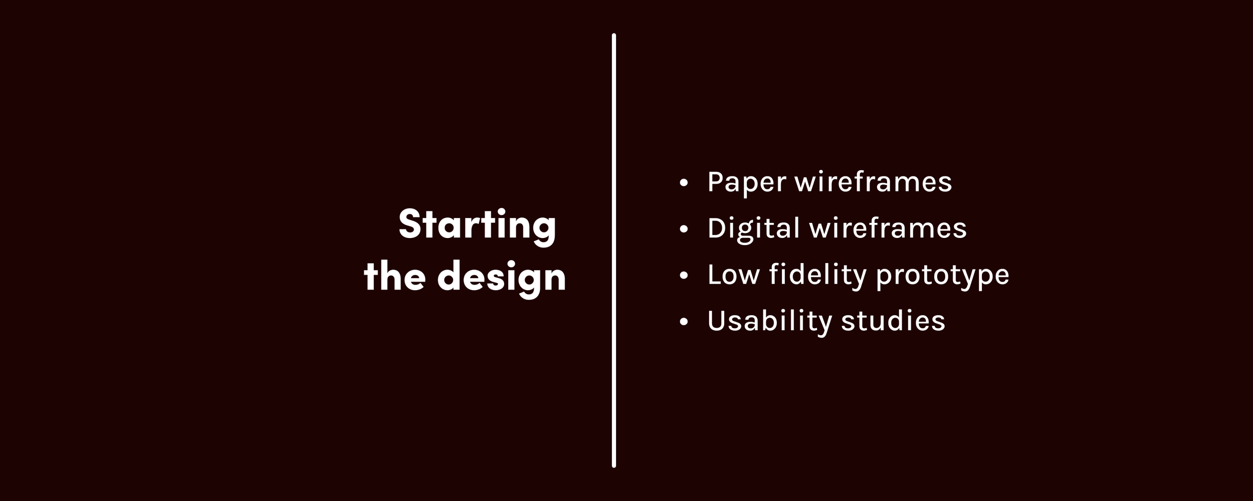
Paper wireframes

The goal with paper wireframing was to consolidate the potential solutions to user problems into something that’s all in one place, visually a step in the right direction, and beginning the process of organizing and defining a product’s architecture.
Digital wireframes
Building the digital wireframes facilitated a much more clear design strategy, and forced me to take more specific and hard looks at existing products for how they organize information, and how I could apply that to my users and their use cases.


Elements that needed to be stressed at this stage were basic menu item selection and customization, a wait time estimate for an order directly before payment, and a clear reflection of the order having been processed.
